
How We Built a Website That Gets a Virtual Sleep Clinic More Bookings
If you run a health or wellness practice, your website has one job above all others: turn a stressed-out visitor into a booked appointment. That's exactly the brief we took on for Just Sleep Care, a new virtual sleep clinic serving all of Alberta — and it's the same brief we bring to every clinic we build for.
Here's what we did, why we did it, and what it can mean for your practice.
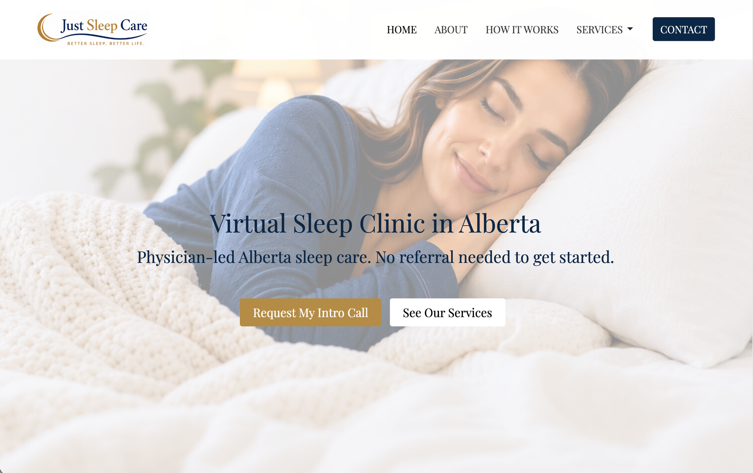
The Challenge: A New Virtual Clinic With No Room for Confusion
Just Sleep Care launched with a simple but ambitious model: Alberta-licensed sleep specialists, delivered entirely online, no referral required. That's a great pitch — but it's also a lot to explain to someone who's exhausted, frustrated, and searching Google at 1 a.m. because they can't sleep.
The site needed to do three things immediately:
Remove the biggest access barrier (no referral needed) before the visitor could bounce
Sort visitors into the right service — sleep apnea, insomnia, snoring, fatigue, or follow-up care — without making them guess
Make booking feel like the obvious next step, not a big commitment
What We Built on Jane Websites
The client chose Jane Websites for this build because it's purpose-made for healthcare practices — and because we've spent years inside its backend. That platform depth means we're not fighting the tool; we're using it exactly as it's meant to be used.
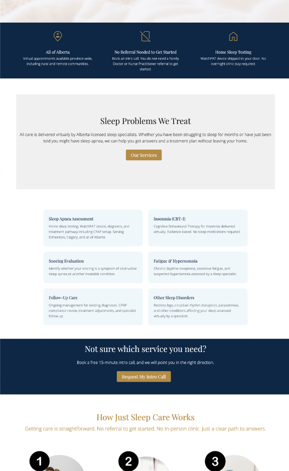
A homepage built around the objection, not the diagnosis. Instead of leading with medical detail, the homepage leads with the three things a new patient actually worries about: Is this available where I live? Do I need a referral? Do I have to go somewhere in person? Each gets its own answer above the fold.
A service breakdown that pre-qualifies visitors. Sleep Apnea Assessment, Insomnia (CBT-I), Snoring Evaluation, Fatigue & Hypersomnia, and Follow-Up Care each get a clear, plain-language card. A visitor self-selects into the right pathway before they ever pick up the phone — which means the clinic's intake calls start faster and more focused.
A "How It Works" flow that lowers the stakes. Three steps: book a free 15-minute intro call, complete an assessment (with a home sleep test shipped to your door if needed), get a diagnosis and plan in days. Laying this out visually turns an unfamiliar virtual-care model into something that feels routine and low-risk.
One consistent call to action, repeated at every decision point. "Request My Intro Call" appears in the hero, after the services section, after the process section, and in the footer. No dead ends, no guessing what to do next.
Why This Matters for Your Practice
Whether you're a solo practitioner or running a multi-provider clinic, the same principles apply:
People decide to book you or leave your site in seconds. If your homepage doesn't answer "can I actually get help here" immediately, the rest of your content doesn't matter.
Service pages should sort, not just describe. A page that helps a visitor recognize themselves in a symptom or service gets you a better-qualified lead than a generic "our services" list.
Virtual and hybrid care models need extra reassurance. If you offer telehealth, remote assessments, or ship-to-home components, your site has to do the work of making that feel normal and safe.
One clear next step beats five competing ones. Every page should point toward a single action.

Built for Health & Wellness Practices on Jane Websites
This is the exact kind of work Sites Setup Solutions specializes in: full website builds and migrations on Jane Websites and Tithely, built specifically for health and wellness practitioners. We handle the platform setup, the copywriting, the conversion structure, and the ongoing care plan — so you can stay focused on patients, not page builders.
If your current site isn't turning visitors into clients, or you're planning a launch and want it done right the first time, let's talk.
See what a purpose-built Jane Websites site could do for your practice.