
Inside a Website Rebuild for
a Louisville Physiotherapy Clinic
When a patient searches for help with pelvic floor pain or a nagging old injury, they're not browsing. They're looking for someone who understands what they're dealing with, and they decide how much to trust you within seconds of landing on your site. That's the standard we built to for Becky, a physiotherapist in Louisville, Kentucky, who welcomed us into a full rebuild of her online presence.
Becky has generously agreed to let this project serve as a case study, so we're sharing the thinking behind it here.
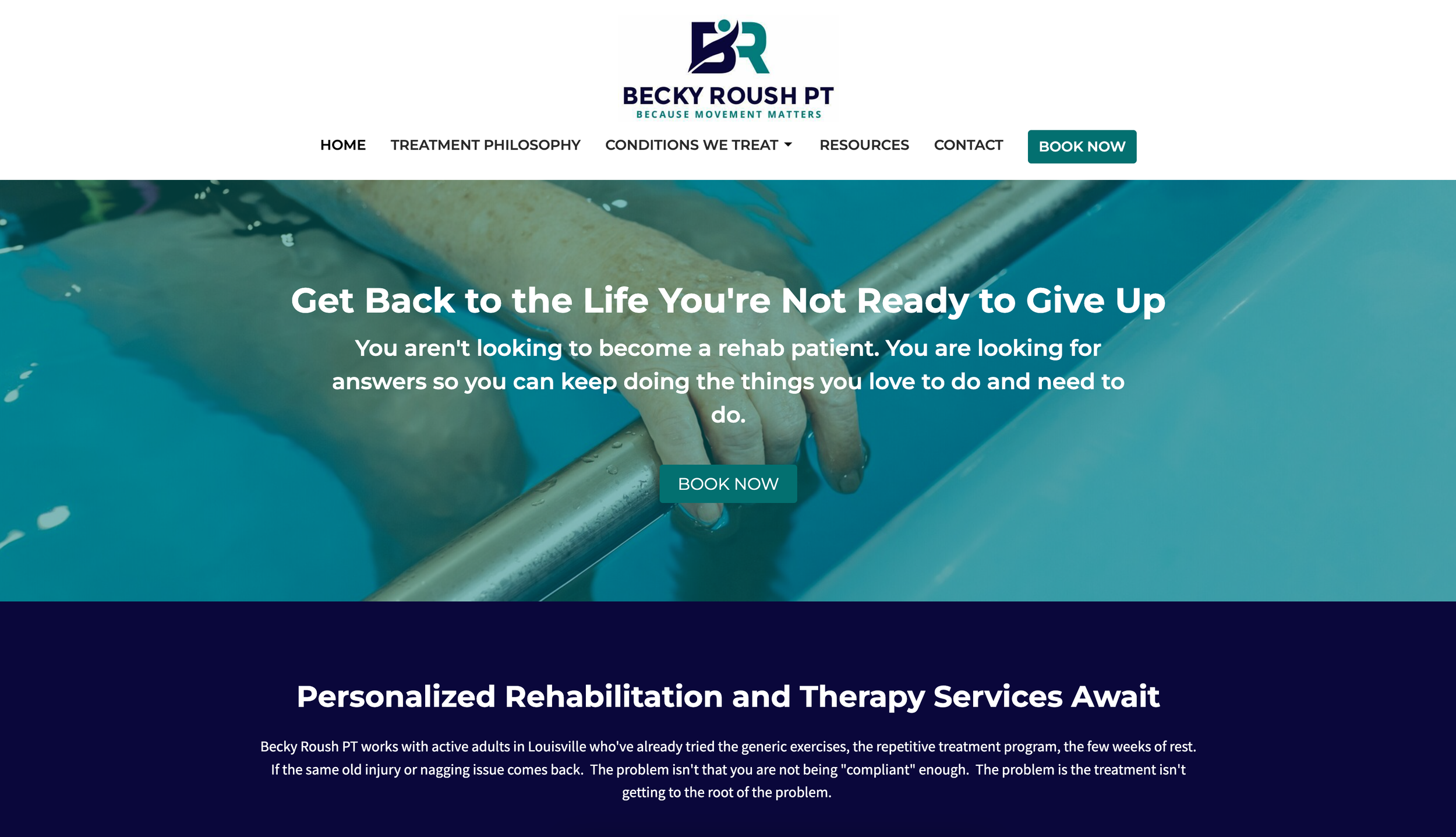
Becky's practice deserved a website that reflected where her work actually happens, not just a template with her name on it.
Her existing site wasn't carried forward into the new build. It served only as reference, at her request.
An earlier document with draft homepage language and testimonials was also set aside rather than reused as source copy.
That meant this was a full content rebuild, built on our Essentials Setup foundation and extended with custom copywriting and photography direction to meet the scope her practice needed.
Starting From a Clean Foundation
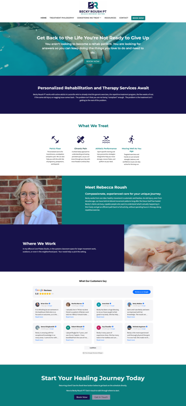
A Site Structure Built Around How Patients Actually Search
Home (with About and Google Reviews folded in, so first time visitors get the full picture right away)
Treatment Philosophy
Conditions We Treat (a hub page, structured
to grow over time)Pelvic Floor
Chronic Pain
Athletic Performance
Moving Well As You Age
Resources
Contact / Book Now
We landed on nine pages, intentionally under the ten page ceiling included in our Essentials package. The goal was never to fill space. It was to make sure every page had a clear purpose for the person reading it.
The Conditions We Treat hub was built with room to expand as Becky adds new focus areas. Pelvic Floor is live now as the first standalone condition page, set up so that down the road, Becky can direct a QR code on printed materials or local advertising straight to that one page. Someone sees an ad, scans a code, and lands exactly where the conversation already started. No searching, no second guessing.
A Space That Reflects the Range of Her Practice
Becky's practice includes a private treatment room, an upstairs studio for Pilates based rehabilitation work, outdoor space, and a pool for aquatic therapy. That range needed to come through clearly, because a website that feels clinical and sterile doesn't reflect the kind of care patients receive here.
Becky came to this project with a full brand kit already in place, logo, colors, and fonts established, and she was open to a design direction that felt warm rather than expected. She was also thoughtful about representation.
As a gender inclusive practice, it mattered that the imagery reflected body diversity and included people without overtly gendered presentation. Small details like this tell a prospective patient a great deal about whether they'll feel comfortable walking through the door.
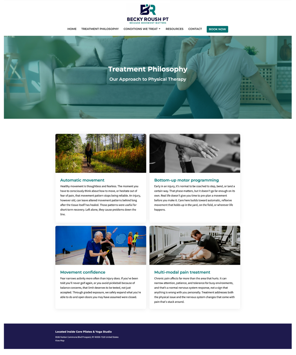
All ten images across the site came from a curated collection selected specifically for Becky's practice, spanning pool based therapy, Pilates based rehab work, hands on physiotherapy treatment, outdoor movement, and imagery reflecting older adult care. Each image was placed deliberately on the page it supports, rather than scattered as generic filler.
A pelvic floor page paired with the right image builds trust before a single word of copy is read. That pairing was never left to chance.
Built to Support
How Patients Book
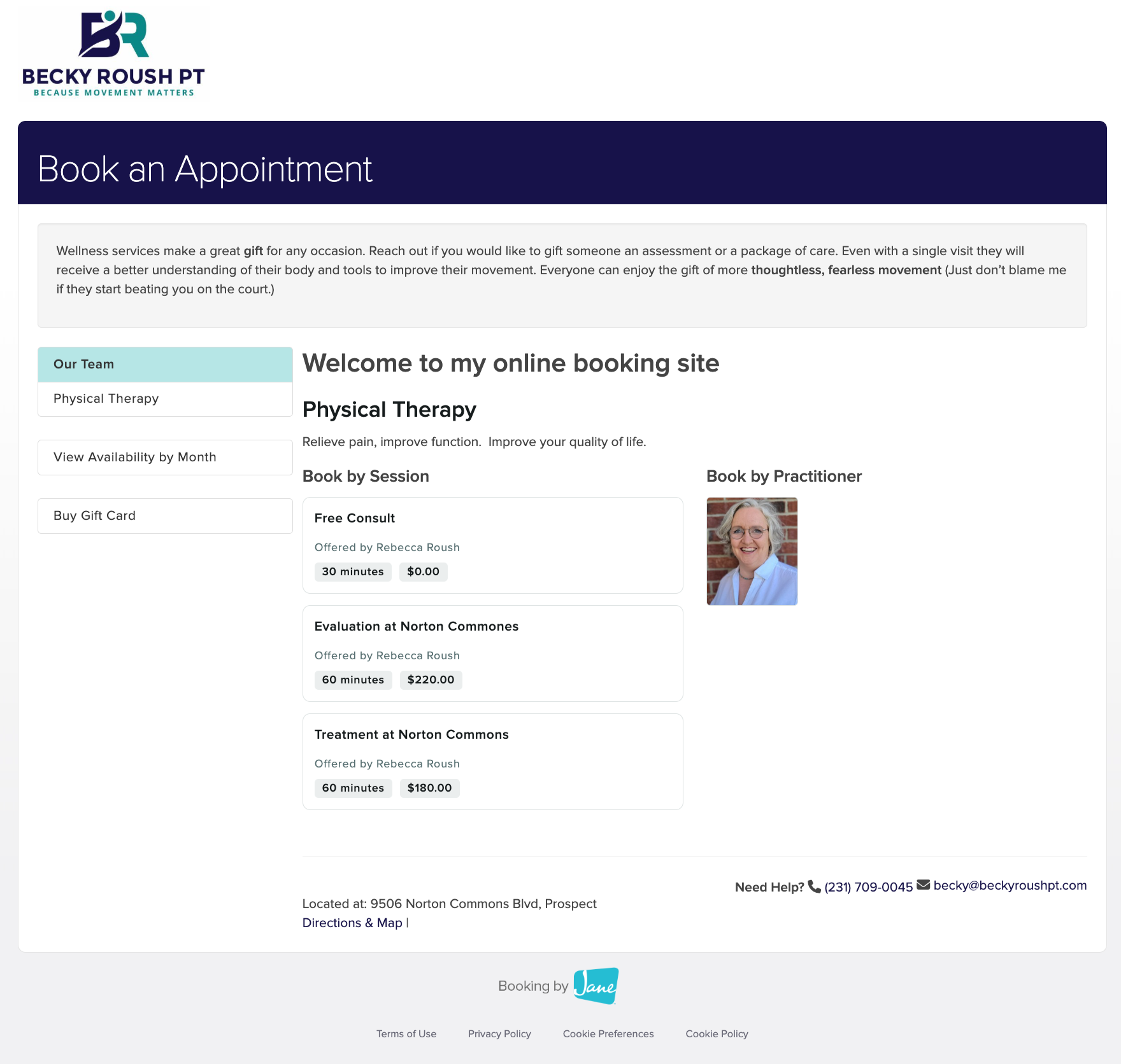
A Book Now button on the homepage, giving returning patients the fastest possible path back to care
The Conditions We Treat hub routing directly into the same Jane App booking link, so advertising or QR code traffic lands somewhere ready to convert
An Elfsight Google Reviews widget, keeping testimonials current and visible without manual updates
Every path on the site was built to lead somewhere useful, because a website that looks good but leaves patients guessing isn't doing its job.

A Steady Foundation for Growth
This build reflects what we believe about clinic websites: they should feel as considered and as trustworthy as the care being offered inside the practice. Becky's site is set up to grow with her, one condition page at a time, without ever losing the sense of care that brought her patients to her in the first place.
If your practice's website doesn't yet reflect the quality of care you provide, we'd welcome the chance to talk it through.
Ready to see what a thoughtful, done-for-you build could look like for your practice?